
The Amsterdam Guide
Brick as art: how the Amsterdam School built beauty for everyone
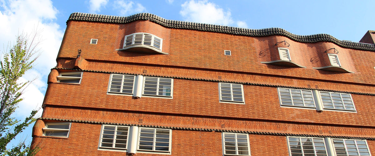
At first glance, Amsterdam School architecture appears to be all fantasy: brick walls that ripple instead of standing still, windows shaped like ladders, towers with no obvious defensive purpose and rooflines that seem to have been drawn freehand. Look longer, and something more serious emerges. This exuberant style was not simply designed to impress wealthy clients. Some of its greatest buildings were made for workers who had previously lived in cramped, damp and badly built rooms.
The Amsterdam School was never a school in the literal sense. There were no classrooms, exams or official membership cards. It was a movement of architects, artists and designers who came together in the 1910s and shared a belief that modern life needed a more expressive architecture. They wanted buildings to shape streets, lift the spirits and unite every detail—from the city block to the door handle—into one work of art.
Their moment was relatively brief, but it transformed Amsterdam. The city still contains complete neighbourhoods where brick behaves almost like fabric: folding around corners, gathering above entrances and wrapping ordinary homes in carefully composed patterns. The Amsterdam School proved that a practical building did not have to be a boring one—and that beauty was not too good for everyday life.
A modern movement born from an old housing crisis
At the end of the nineteenth century, Amsterdam was growing rapidly. Industrialisation and expanding harbour activity drew workers into the city, while housing construction struggled to keep pace. Speculative landlords divided buildings into small dwellings, and many families lived with overcrowding, poor sanitation, little daylight and persistent damp.
The national Housing Act of 1901 changed what municipalities could do. It required building and housing regulations, made it possible to condemn unhealthy homes and provided financial support for non-profit housing associations. Amsterdam used those powers ambitiously. Housing was no longer treated solely as a private commodity; it became part of a wider project to build a healthier, more organised city.
That legislation did not prescribe curling brickwork or sculptural towers. It created the conditions in which housing associations could commission better homes, while architects and municipal designers could think at the scale of entire streets and neighbourhoods. Between 1917 and 1922, the city and its housing associations completed almost 6,500 homes.
The social ideal mattered. Good housing needed light, air and sanitation, but the Amsterdam School added a radical question: should it not also offer dignity, identity and delight?
The Scheepvaarthuis: where the new language surfaced
The movement’s first defining monument was not social housing but a luxurious corporate headquarters. Built between 1911 and 1916 for six Amsterdam shipping companies, the Scheepvaarthuis on Prins Hendrikkade gathered a remarkable team of designers under lead architect Joan van der Mey. Michel de Klerk and Piet Kramer contributed architectural work, while sculptors, stained-glass artists, metalworkers and furniture makers developed the maritime theme down to the smallest details.

Ships, waves, sea creatures and symbols of navigation appear across the building, but rarely as simple decoration pasted onto a wall. They are worked into stone, brick, iron and stained glass. The interior continues the same visual world through carpets, furniture, lighting and wall finishes. The result is a Gesamtkunstwerk: a total work of art in which structure, ornament and furnishing belong to one idea.
The building revealed both the promise and the contradiction of the movement. It showed how extraordinary a fully coordinated design could be, yet it celebrated shipping companies enriched by colonial trade. Soon the same architectural imagination would be directed towards affordable housing. The Amsterdam School was never politically or socially uniform; its designers moved between corporate prestige, public service, private interiors and workers’ homes.
Brick that refuses to sit still
Brick was the movement’s favourite material, but Amsterdam School architects treated it as far more than a practical outer skin. They varied its colour, texture, bond and direction. Courses of brick bend around windows, project from flat walls or form bands that emphasise a curve. Carefully shaped bricks create rounded corners, deep entrances and shadows that change throughout the day.
The buildings are often described as expressionist because their forms communicate emotion and movement. A façade can feel protective, theatrical, monumental or almost alive. Small windows may be arranged in powerful horizontal rows, while towers and chimneys turn an ordinary roofline into a city landmark. Sculptures by artists such as Hildo Krop are not separate objects placed in front of the architecture; they are woven into bridges, walls and entrances.
There was no fixed checklist. Some buildings are wildly sculptural, others comparatively restrained. What connects them is a concern for material, craftsmanship and the spatial experience of the street. The façade does not merely enclose rooms. It turns a corner, marks an entrance, frames a square and helps an entire block feel like a composed whole.
Het Schip: a workers’ palace in red brick
The best-known Amsterdam School housing complex stands in the Spaarndammerbuurt, a neighbourhood developed for workers from the nearby docks. Designed by Michel de Klerk for housing association Eigen Haard and built from 1919 to 1921, Het Schip contained 102 dwellings, a school and a post office.
Its nickname—“The Ship”—was inspired by the triangular block, pointed forms and long, flowing façades. A slender tower rises like a mast, although it contains no grand room and serves mainly as an urban marker. Curved bays, unusual windows and deep red brick give the complex a monumental presence without disguising its domestic scale.
Calling Het Schip a “workers’ palace” does not mean its apartments were palatial in size. The phrase describes the dignity of the whole. Instead of treating affordable housing as an anonymous row of minimum-standard units, De Klerk gave the block a recognisable identity and placed it around a green public space. The architecture told residents that their homes mattered to the city.
The former post office made that message especially clear. De Klerk designed its windows, fittings, stained glass, wall clock and intense colour scheme as parts of one interior. Even an everyday municipal errand could take place inside a carefully imagined work of art.
De Dageraad and the making of Plan Zuid
Amsterdam School architecture reached its greatest urban scale in the southern expansion designed by H. P. Berlage. His Plan Zuid, approved in 1917, established broad avenues, intimate side streets, squares and monumental urban blocks. Berlage designed the framework, not all the buildings within it. Housing associations then commissioned Amsterdam School architects to give those streets their architectural character.

De Dageraad, designed by Michel de Klerk and Piet Kramer between 1918 and 1923, is one of the finest results. Its 294 dwellings and six shops form part of a larger ensemble of streets and squares. Red and yellow brick alternate across undulating walls; horizontal glazing bars stretch the windows; tower-like corners announce changes in direction.

The project demonstrates a central Amsterdam School idea: a neighbourhood should be experienced as more than a collection of individual façades. Buildings guide the eye and shape the public realm. Corners become events. Roofs create a shared skyline. Repetition gives rhythm, while small variations prevent the street from becoming mechanical.
There was also tension between outer drama and inner practicality. Heritage documentation notes that some floor plans were made subordinate to the desired façade. The architecture offered dignity and visual richness, but expressive windows did not automatically produce the most convenient room behind them. The Amsterdam School deserves admiration without pretending that every artistic decision was perfect domestic planning.
The city as one enormous interior
The movement extended far beyond housing. Amsterdam’s Public Works Department employed architects to design schools, bathhouses, transformer buildings, tram facilities, street furniture and bridges. Piet Kramer became particularly influential in this municipal work, often collaborating with sculptor Hildo Krop.
A typical Amsterdam School bridge is not only a route across water. Its brick abutments, stone sculpture, iron railings and lamps establish a small architectural place. Approaching the bridge, crossing it and viewing it from the canal are treated as related experiences. Even utility boxes, fire alarms and kiosks were given distinctive forms.
This attention made the city resemble an enormous shared interior. The street had furnishings; the bridge had ornament; the housing block behaved like a carefully arranged room. Public design was not regarded as background equipment to be ordered from a catalogue. It was part of how residents understood and valued their neighbourhood.
Wendingen: the movement in print
The Amsterdam School developed its public identity through Wendingen, the striking magazine launched in 1918 for the architectural society Architectura et Amicitia. Architect and graphic designer Hendrik Wijdeveld was its central force. Across 116 issues published until 1931, the journal covered architecture, visual art and applied design in the Netherlands and abroad.

Its unusual square format, roughly 33 by 33 centimetres, already refused the appearance of a conventional professional journal. Covers were designed by different artists, typography became illustration and many issues were bound with raffia. The magazine’s presentation embodied the same conviction as the architecture: information, material and artistic form should reinforce one another.
Wendingen was not merely a club newsletter for one local style. It introduced Dutch readers to international artists and architects, including Frank Lloyd Wright and El Lissitzky. Its title means “turnings” or “changes”, an apt name for a publication that treated modern design as an open, constantly developing field.
From façades to furniture and fabric
The total-artwork ideal continued behind the front door. Amsterdam School designers produced furniture, lamps, clocks, carpets, stained glass, ceramics, book covers and complete room schemes. Forms seen in the architecture—angular profiles, sculptural curves and strong geometric rhythms—reappeared at the scale of a chair or cabinet.

Textiles were essential to these interiors. Heavy curtains, upholstery, carpets and decorative cords softened the dark wood and brick while adding colour and tactility. Surviving documentation for a 1916 furniture suite by De Klerk describes green wool upholstery with cords, rosettes and tassels. This was not architecture that stopped at the plaster line; fabric helped complete the composition.
Margaret Staal-Kropholler, a major architect of the movement and the first woman in the Netherlands to practise independently as an architect, paid particular attention to domestic life. Her work connected expressive form with storage, circulation and the practical organisation of the home. Other women—including graphic designer Tine Baanders and sculptor Louise Beijerman—also contributed to a movement too often summarised as a trio of male architects.
For a modern interior, copying Amsterdam School motifs literally can quickly turn a room into a stage set. Its more useful lesson is the relationship between materials. Wood, brick, glass, metal and fabric were designed to speak to one another. A contemporary room can follow that principle without acquiring a turret-shaped bookcase and frightening the neighbours.
Influences, ideals and uncomfortable histories
Amsterdam School design grew from many sources: European expressionism, Dutch brick traditions, Berlage’s architecture, maritime imagery, craft practice and forms encountered through the colonial world. Indonesian buildings, objects and decorative traditions influenced several designers. That exchange cannot be described innocently as a taste for the “exotic”. The Netherlands’ colonial power made those materials and visual cultures available under profoundly unequal conditions.
The movement also resists a single political label. Its social housing was connected to progressive ideas about collective welfare and workers’ emancipation. At the same time, its architects accepted commissions from shipping companies, wealthy clients and luxury manufacturers. An expensive handcrafted chair and an affordable apartment could share the same artistic language.
That contradiction is part of the history, not a reason to flatten it. The Amsterdam School’s most lasting achievement was not a pure political programme. It was the insistence that architecture and design could give public presence to lives and activities usually treated as ordinary.
Why the movement faded
Michel de Klerk died of pneumonia in November 1923, on his thirty-ninth birthday. His death removed the movement’s most brilliant formal inventor and marked the end of its most exuberant phase, but the Amsterdam School did not disappear overnight.
Housing subsidies were reduced, budgets tightened and architects were increasingly asked to wrap standardised apartments in simpler façades. The economic crisis accelerated that process. Meanwhile, functionalism and the New Objectivity promoted a different modern ideal: light, air, efficiency, industrial methods and little applied ornament.
By the 1930s, Amsterdam’s planning culture had shifted decisively. The General Extension Plan adopted in 1935 favoured open modernist development rather than the enclosed, theatrically modelled street blocks of the Amsterdam School. Yet municipal buildings, bridges and street objects continued to carry its influence, and its designers never all moved in the same direction at the same time.
Later generations rediscovered what functionalist criticism had dismissed. Restoration and heritage protection revealed the technical sophistication of the brickwork, the importance of the interiors and the social ambition behind the housing. Het Schip’s major restoration between 2015 and 2018 was not an exercise in polishing an eccentric façade; it recovered the building as a complete work of urban, architectural and social history.
Where to recognise the Amsterdam School today
The movement is best understood by seeing several types of work rather than one famous building:
- Het Schip, Spaarndammerbuurt: the clearest introduction to Michel de Klerk’s housing architecture and the movement’s relationship with social reform.
- De Dageraad, Amsterdam Zuid: an urban ensemble where façades, corners, streets and squares form one composition.
- The Scheepvaarthuis, Prins Hendrikkade: the movement’s opulent corporate beginning and one of its most complete total artworks.
- Plan Zuid and the Rivierenbuurt: neighbourhoods where the Amsterdam School operates at the scale of long streets and housing blocks.
- Bridges and street furniture throughout the city: evidence that its designers considered public infrastructure worthy of art.
- The Tuschinski Theatre: not a pure Amsterdam School building, but a spectacular contemporary mixture of Amsterdam School expressionism, Art Deco and other decorative influences.
Look beyond the towers. The style often reveals itself in smaller decisions: a brick course turning around a doorway, a carefully shaped window, carved stone at the end of a bridge or ironwork designed for one exact location.
Beauty as a public responsibility
The Amsterdam School did not solve Amsterdam’s housing problem, and its architecture was not always as practical as its social ambitions suggest. It was costly, craft-intensive and tied to a particular political and economic moment. Yet it asked a question that remains unexpectedly current: how much beauty should society invest in ordinary life?
For its best architects, the answer was not “whatever is left after function”. A workers’ dwelling, a post office, a bridge and a magazine cover all deserved artistic care. Materials were allowed to show character. Streets were designed as places rather than traffic channels. Interiors combined structure, furniture, light and textile into a whole.
That is why the movement still feels so alive. The façades may be a century old, but their argument has not aged: useful things can also move us, and a city becomes richer when good design is not reserved for the people behind the grandest doors.